At the beginning, we didn’t really know how our logo should look like. For sure, there should be a robot to express our research on teenagers and their ability to use conversational AI.
Read here about our journey from a blank space to our logo. Alessia started out thinking about how a robot like NAO could fit into a small picture. Even if the logo is small in size, people should still be able to recognize the robot.
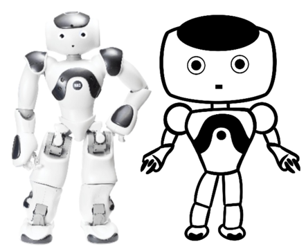
Just the face of the robot was not enough. Hence, Alessia drew a caricature of the entire body, highlighting the main features of NAO’s design. Also borders should not be too bold and areas of the body not overfilled with one color to make the robot nice to look at.
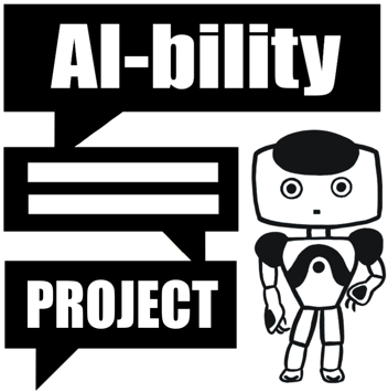
Since our research is about conversational AI (including robots, chatbots and voice assistants), Alessia wanted to emphasize the speech capability. The best way to make it clear was putting the title of the project in chat-boxes.
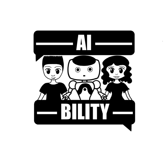
Last but not least, the children or teenagers. The robot is placed as a peer or friend between two young children so that children with all genders could identify with it.
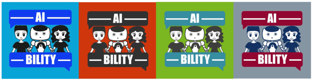
Finally, time to give the logo a vibe with colors. The final logo versions correspond to each partner’s university colors. This not only creates variety, but also allows developing identify with the university and project. How do you like the logo?
Authors: Alessia Orlandi, Isabella Seeber